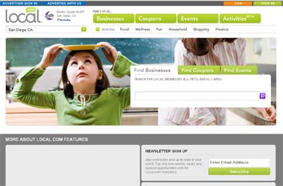
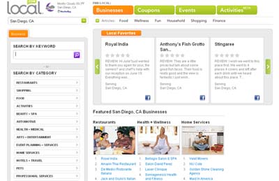
I was excited when I was asked to peruse a website in order to give my opinion on the look and feel, navigation, platform and so on. The website I had the pleasure of perusing is, www.local.com a site that helps find local listings and services near your specified location.
{Please note that all the opinions I give here are my own and I was not compensated in any way to share my thoughts.}
Now that we got that out of the way…I will first say that the overall design and color pallet is very easy on the eyes. It is fresh and inviting. Personally, I am very picky about a website’s look and feel so this was important for me. Content of course is equally important, but just as in a blind date, attraction at least chemistry must be present before moving forward. I’m just saying! The design and layout is quite simple, and the photos used are vibrant and engaging. A great look if you ask me…and you are!
I will admit that at first I was unsure about what the site was offering. Although the site didn’t seem intimidating at first look, I was a bit overwhelmed with all the content and all the possibilities after diving. However, once I continued to search the site it became clear that it was a directory of some sort and that the content was in fact organized in some fashion.
The way the site is set up, you cannot easily see that you can search multiple cities. I had to scroll down to find the national listings or states listed, which someone who is not reviewing the site might miss. Maybe if the list was somehow strategically placed at the top or on the side it might help visually; however it may tamper with the current look. I’m sure there is a way to go around this.
Another pet peeve I should say of mine was that I found myself wishing that the columns were switched. I get that we read from left to right which is probably why the categories are placed on the left and the content, ads, reviews and so on are placed on the right; however it just seemed a little off balance for me. It may be a matter of getting used to the layout but it doesn’t hurt to try. Maybe once signed in a user can have the option to change their ‘settings’ for lack of a technical term. Basically, they can have the option of changing the colors, and changing the way they see the information. The options can be minimal as to not overwhelm the user of course.
Overall, the site is fairly easy enough to navigate. I decided to create an account to get the full experience which allowed me to search listings specific to my zip code. Local.com actually has a lot to offer. Not only do they provide listings, share coupons and promote events they also list articles directly related to the listing, product or service you are searching for. In comparison to other listing sites such as yelp, Local.com has a lot going for it.
I depend on yelp a lot via mobile to search for local listings, get directions and read reviews before heading out to my destination, especially if I’m trying something new. What I don’t like about the yelp application for Blackberry is that there is no way to write a review from your phone directly. I did not see a smart phone application for Local.com as of yet. I hope it is in the making because I would definitely use it. If I missed it, please point me in the right direction.
What really stood out to me on Local.com was that although the site seemed overwhelming with information, that is not necessarily a bad thing. The more information the better, as long as I can easily access it. I like that on Local.com you are able to write reviews, share listings via Facebook and Twitter. The site proves to be easily interactive, which is important as a blogger and someone who embraces social media. People don’t want to log into another account to share something found on another site. In fact the more I research this site, the more I like it; and the more it seems like what I call a stand-alone site, meaning I can do practically everything I need to here. I guess it’s what most people call a ‘one stop shop.’
In addition, the site is also very user friendly for businesses interested in advertising on the site. They do a great job of educating the general public about their services, opportunities to partner and how the company works and why people should invest in it.
I would recommended this site to a friend despite the minor cons. There aren’t that many listings for San Diego; however I’m looking forward to seeing what else this site can do. I did not become hip to this site until someone pointed it out to me. I’d be curious to know how they market, social media perhaps?
From the local.com website:
Local.com (NASDAQ: LOCM) owns and operates a leading local search site and network in the United States. Its mission is to be the leader at enabling local businesses and consumers to find each other and connect. To do so, the company uses patented and proprietary technologies to provide over 20 million consumers each month with relevant search results for local businesses, products and services on Local.com and more than 1,000 partner sites. Local.com powers more than 100,000 local websites. Tens of thousands of small business customers use Local.com products and services to reach consumers using a variety of subscription, performance and display advertising and website products. Local.com consistently ranks in the top 100 in U.S. website traffic according to Internet research firm, comScore. Local.com is one of the top 10 local search engines according to Nielsen, and the Kelsey Group ranked Local.com one of the top 3 fastest-growing local online advertising companies.
The company is based in Irvine, Calif. and has an office in Redondo Beach, Calif.


